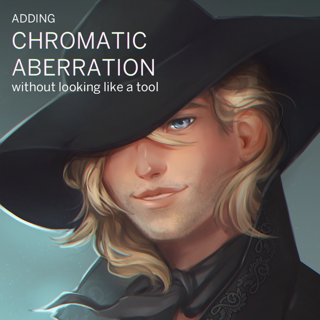
Hey guys! Here's a quick tutorial on adding chromatic aberration to your finished paintings. To clarify, much like anything in art, using post production filters like this comes down to taste and purpose: CA can look really good for pieces done in sci fi settings, for taking some parts of your painting out of focus and making other edges shine, for painting refractions and water. And, much like anything in art, if you overdo it, all of the internet will know what you've done.

"He put a 20% noise filter over it, too."
I like using chromatic aberration, especially with portraits, because it can bring out some cool color variation on skin and hair. There are a few ways to do it in Photoshop, and this is the method I prefer because it allows for the most control over my image.
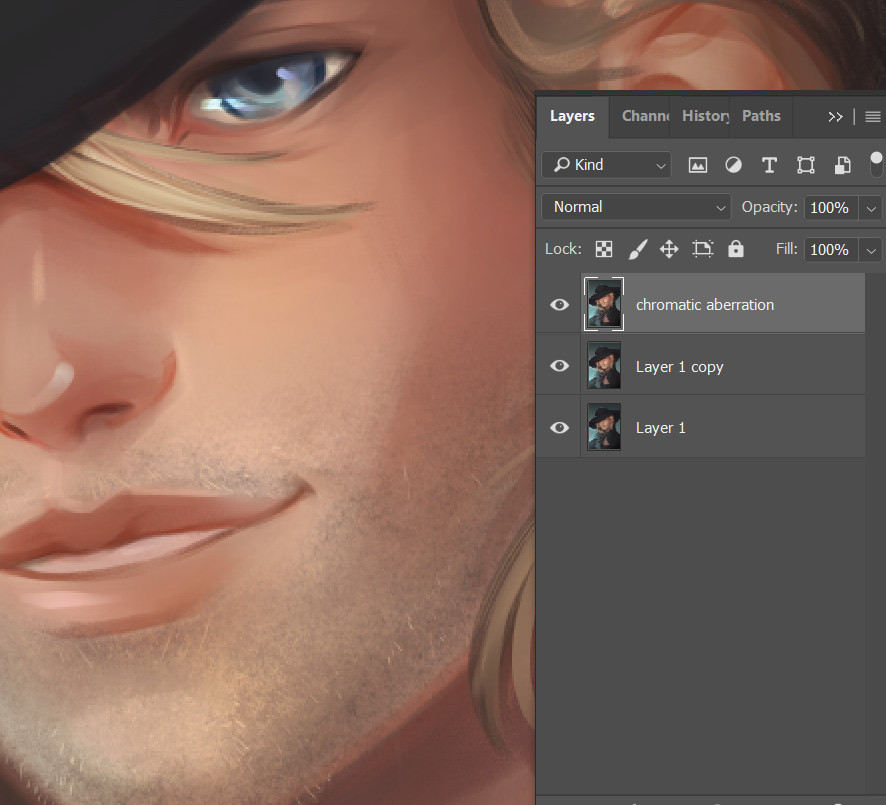
First, duplicate your image layer and rename it. I like to lock my layers below because by the time I am done a piece, my will to live and brain power has been reduced to the speed of a 90's dial up modem and I forget about best lossless editing practices.
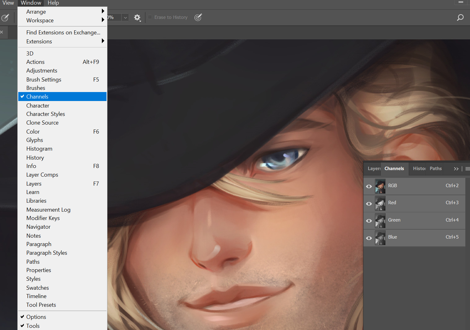
Now we make sure that a Channels window is open. FYI, SAI and Clip Studio both have this option! That said, I am still not entirely sure what channel layers are, but to my understanding they function as a layer mask generated from pixel density of their respective colors.

Once you click on one of these channel layers, you will see a black and white image map of your chosen color. From here, press ctrl+a to select the entire image in Photoshop. Then press V, or your move tool shortcut with the whole image still selected. Then, nudge the image up using your arrow keys.
Press ctrl+d to deselect the whole image, click on the next color channel, and repeat the process nudging the image right for green, and down for blue respectively. The directions don't matter terribly, but this is the most natural looking combination I've found, and so long as you're moving the layers a pixel away from each other and deselecting between nudges, you should be fine.
I don't recommend doing this farther than one or two pixels, but you can get some neat effects like this as well. Click back to the top layer at any time to see if the changes you are making are to your liking!

"Ah yes, now it really looks like a concept art."
You will also likely notice a nasty solid line of pixels running on either sides of your image. We're going to get rid of this momentarily.

Select everything with ctrl+a again. Then to to selection -> modify -> border, and pick a value.

Since I've only nudged the image 1 pixel per channel, I double that number and use the width of two pixels to turn my selection into a border.

Ctrl+x to cut out that sucker and we are done!

Erase away at the chromatic aberration layer to make its effects more subtle and sharpen up parts of your image you want to draw the eye to. If the whole image still feels blurry, you can flatten it and try running an unsharp mask filter once or twice to your linking.
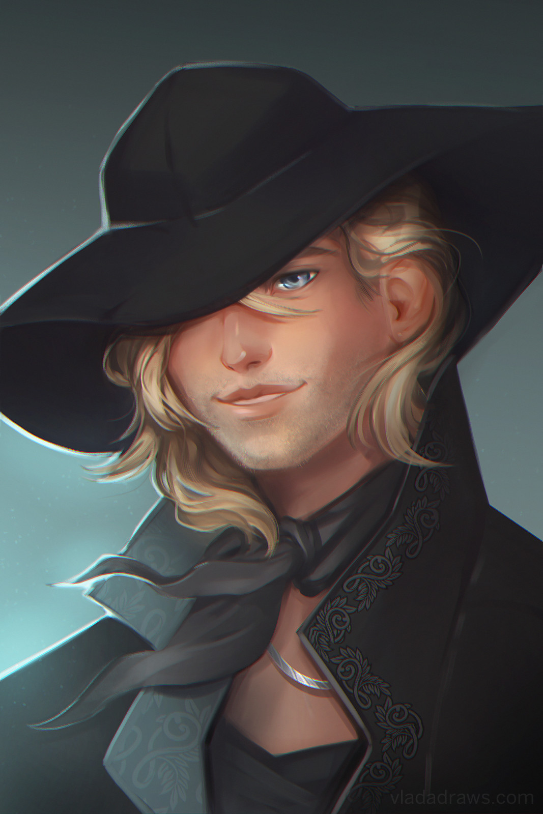
Thanks for tuning in!